Designing for Mobile: Best Practices for Limited Screen Space and User Attention Span
This article discusses the best practices and tips for designing specifically for mobile devices.

According to bankmycell, 91.40% of people in the world own a mobile phone. The use of mobile devices is growing rapidly. It is essential to optimize websites and applications for small screens and short attention spans. This will ensure that your products are accessible and engaging for your users.
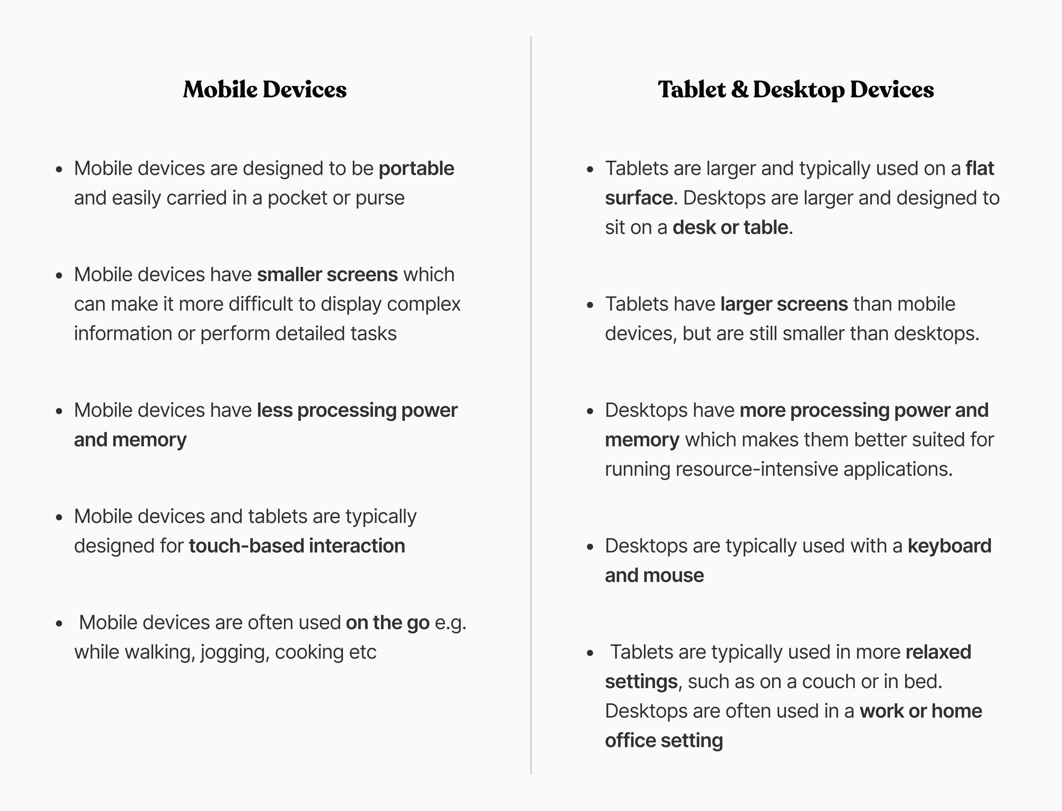
Designing for mobile requires a different approach than designing for desktops. Mobile devices, tablets, and desktops differ from each other in several ways. Users interact with mobile devices differently than they do with desktops. This blogpost discusses the best practices and tips for designing specifically for mobile devices.
How do Mobile Devices, Tablets, and Desktops Differ from Each Other?
Best Practices And Tips For Designing For Mobile Devices
1. Use High Contrast For Quick Glance
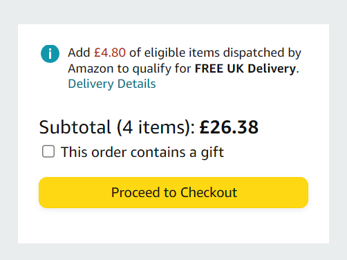
High contrast can help users quickly identify key elements on a page, such as text, buttons, and other interactive elements. Using high ensure that elements stand out and users can easily to distinguish from one another.
Designing an e-commerce app? Use high contrast to make important elements stand out. For example, the "Add to Cart" button and the product price. This makes it easier for users to quickly find and purchase the products they are interested in.
2. Provide In-Context Control
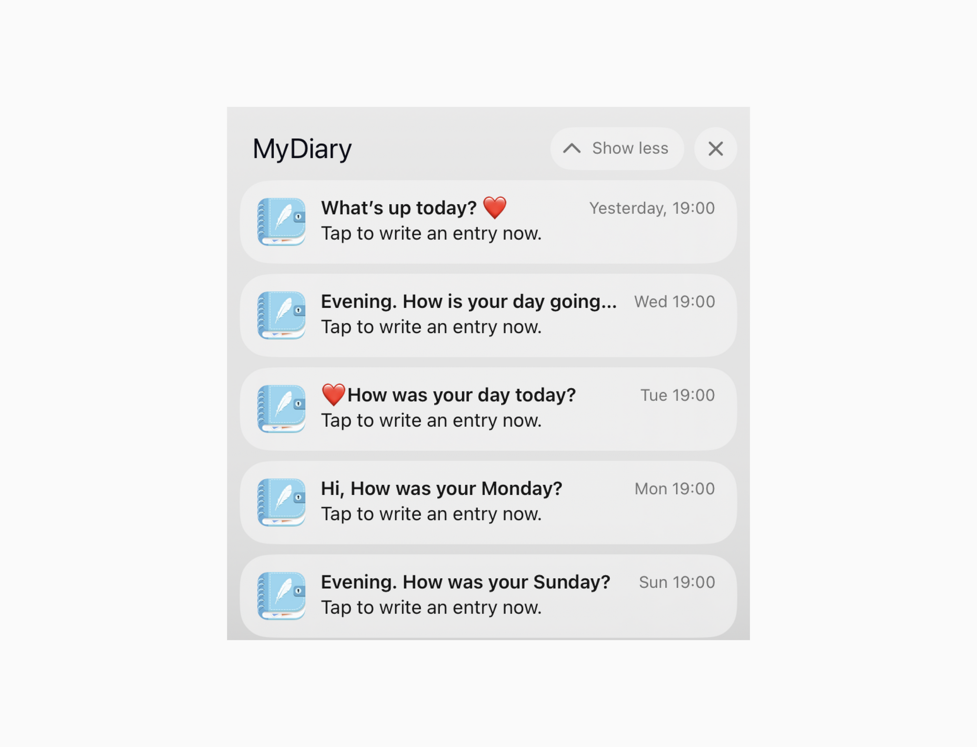
In-Context Control means that users can access the necessary controls and options in the context of the task they are currently performing, without having to navigate away from the current screen.
For example, if you are designing a mobile messaging app, you can provide in-context control by allowing users to reply to messages directly from the notification panel, without having to open the app. This makes it faster and easier for users to respond to messages, especially when they are on-the-go.
3. Use Visual Metaphors
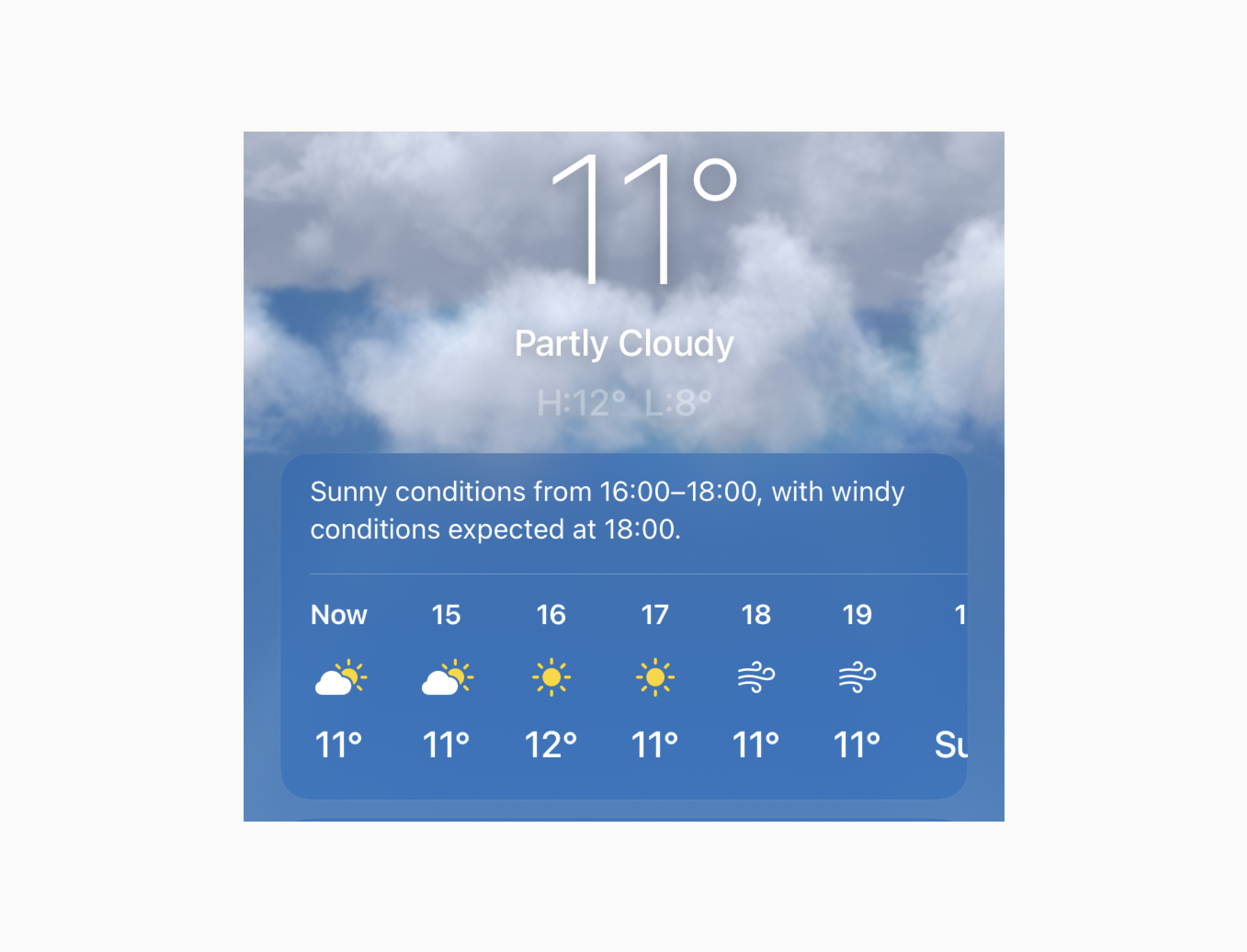
Visual metaphors are images or graphics that represent an idea or concept, making it easier for users to understand and remember information.
Designing a mobile app for a weather? Use images of the sun, clouds, or raindrops. These can represent different types of weather. For example, a sun symbolizes sunny weather, while raindrops indicate rain. This makes it easier for users to quickly understand the current weather conditions, even if they are in a hurry.
4. Optimized Visualization For Comprehension
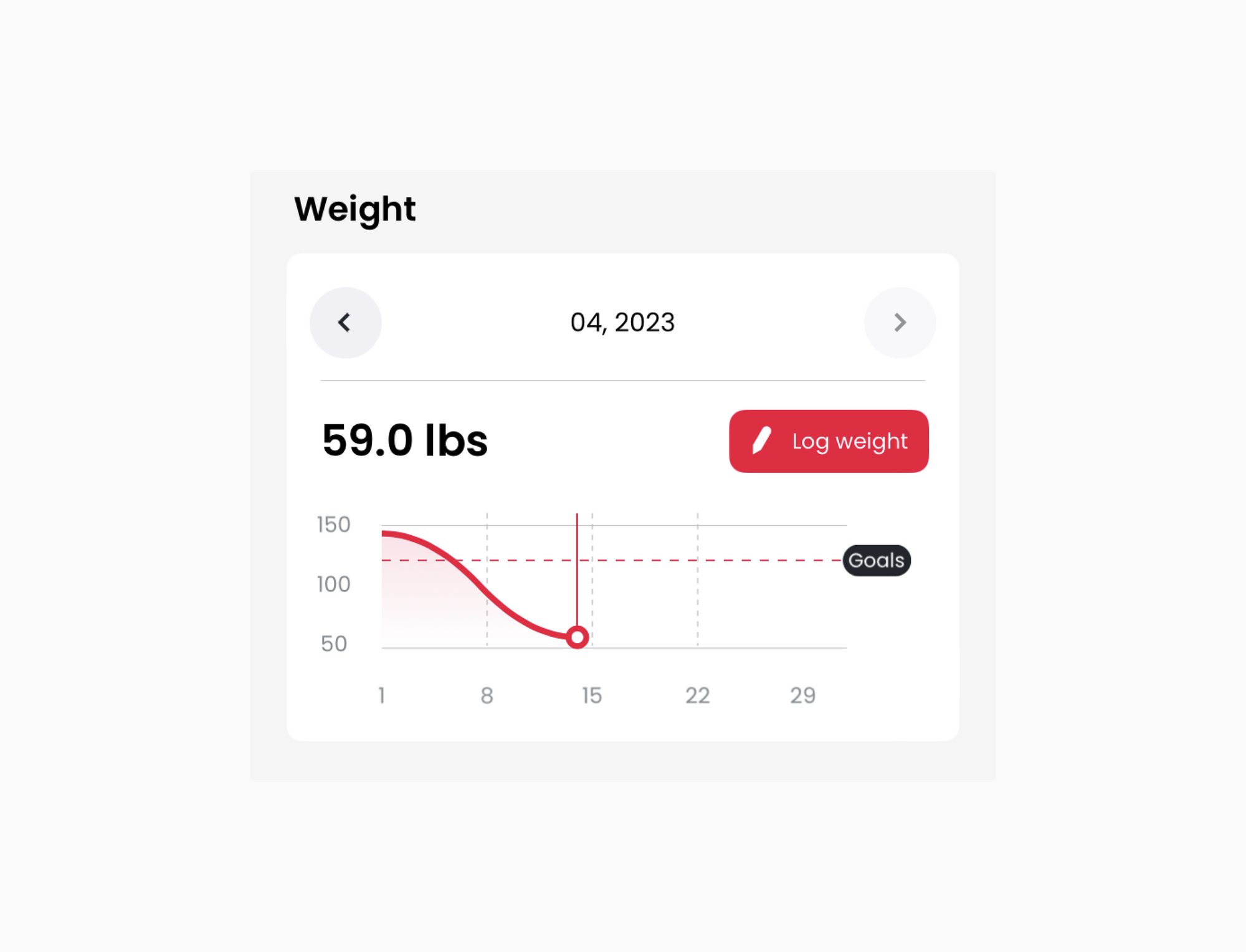
Optimize visualization for comprehension by using simple, easy-to-understand visuals that convey information quickly and accurately. Use charts, graphs, and other data visualization techniques to help users understand complex data.
For example, for a fitness app, use clear, easy-to-understand charts and graphs to visualize progress towards fitness goals, such as weight loss or steps taken. You can also use color coding to indicate areas where improvement is needed.
5. Tease Visibility
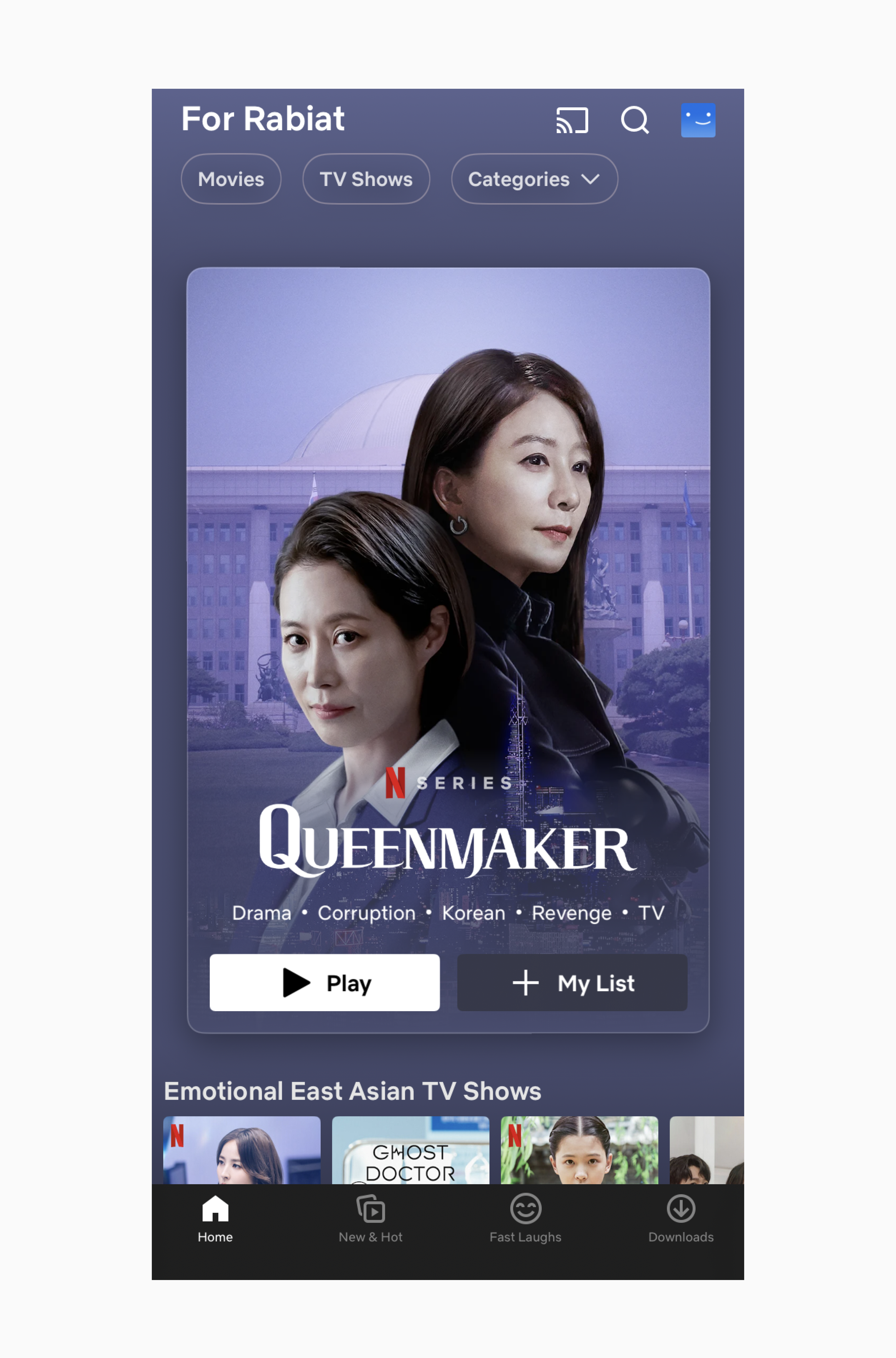
Tease visibility means that you show just enough information to pique the user's interest, without overwhelming them with too much information. Use visual cues to tease visibility and encourage users to explore and interact with interface elements. For example, Netflix entices users by displaying movie previews on the main screen, offering a glimpse of what's available and tempting them to click and watch. Additionally, this approach enables users to quickly scan and locate movies of interest, bypassing the need to navigate through multiple pages.
6. Navigation
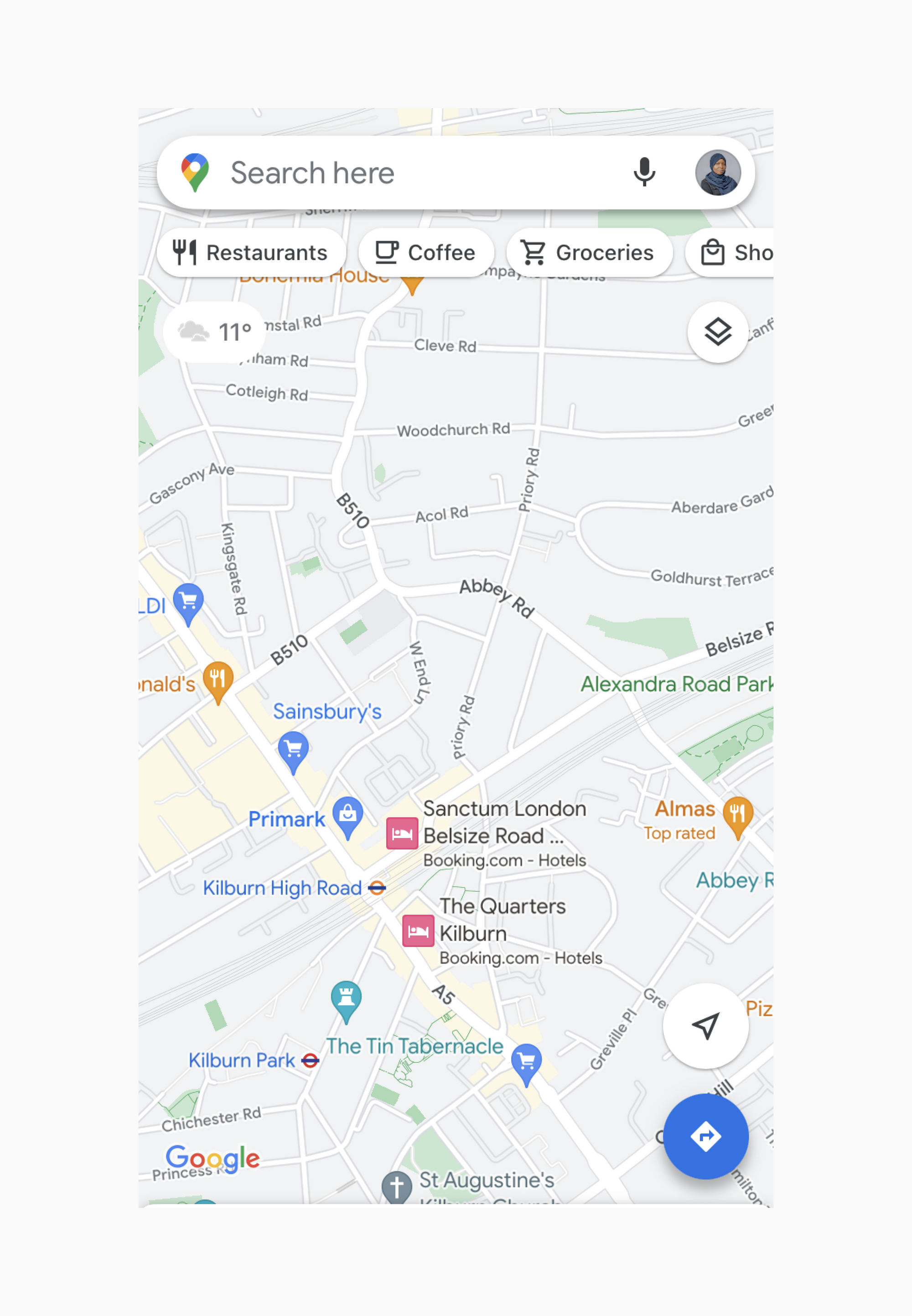
Make sure that navigation is easy to use and intuitive. Use clear labels and icons to help users find what they are looking for quickly. Make sure to consider the user's context (understand how users will be using the app and design the navigation accordingly). For example, if the app is designed for use while driving, the navigation should be voice-enabled and hands-free.
7. Page Load Performance
Users on mobile devices have a low tolerance for slow loading pages, and a slow-loading interface can lead to frustration and abandonment. Ensure that pages load quickly and smoothly. Avoid large images and other assets that can slow down page load times.
8. Less Visual Density
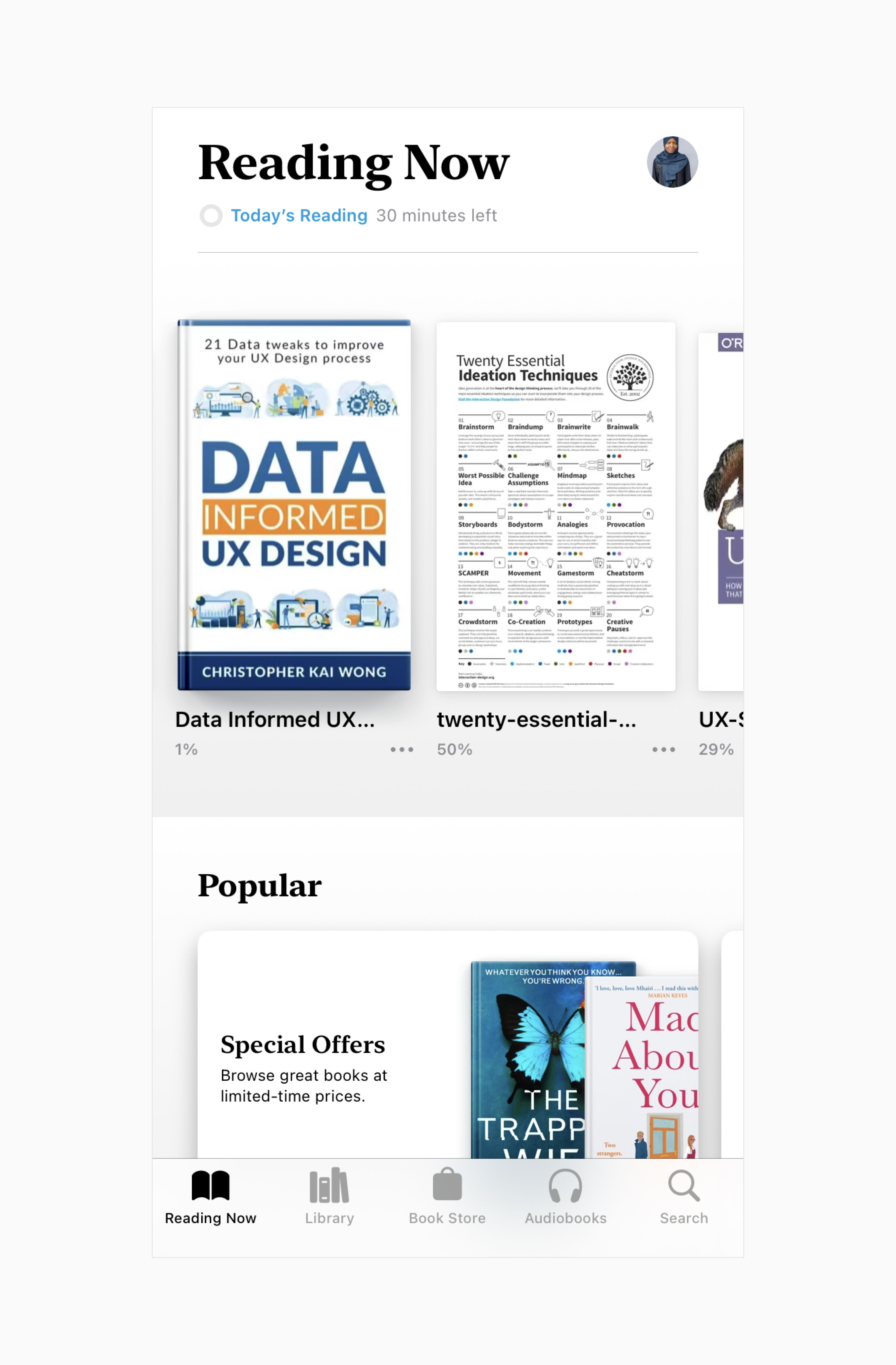
Less visual density is a design principle that refers to reducing the amount of visual information presented on the screen to improve readability and reduce cognitive load. This is particularly important for small screens and limited attention spans, where users have a smaller amount of screen real estate to work with and may be easily overwhelmed by too much visual information.
For example, Apple book app uses visual hierarchy to highlight important elements and white space to provide visual separation between books.
9. Proximity
Group related elements together to create a sense of visual proximity. Elements that are placed near each other are perceived as related, while elements that are farther apart are perceived as separate. Proximity is an important consideration for small screens and limited attention spans because it can help to organize information and reduce cognitive load.
10. Content First
Put content first by ensuring that it is easy to find and consume. Prioritize the user's needs and present information in a clear and concise manner, with a focus on delivering value to the user. Use clear headings, subheadings, and other formatting techniques to make content easier to scan and read.
11. Fat Finger Friendly
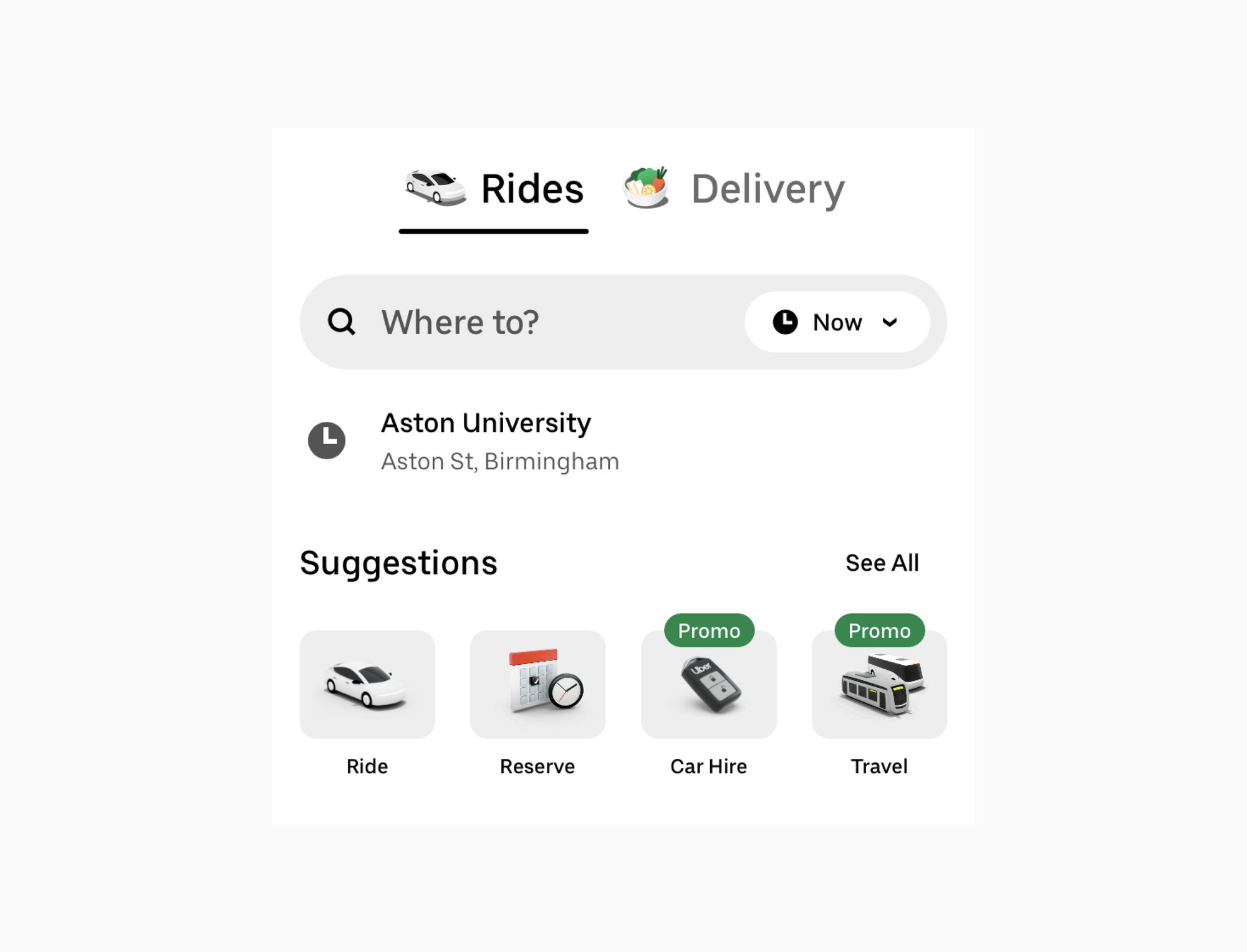
Make sure that interactive elements are large enough to be easily tapped with a finger. Use spacing and other layout techniques to ensure that interactive elements are not too close together.
In conclusion, designing for mobile devices requires certain degree of considerations, given the limited screen space and attention span of users. By keeping these best practices in mind, designers can create mobile interfaces that are not only visually appealing, but also accessible and usable for all users, regardless of their screen size or attention span.

